
Brand Identity • Wayfinding
Back to Projects
Hospital Branding System
Comprehensive brand identity system design for Hospitel. The visual language balances healthcare trust, accessibility, and modern medical excellence across digital UI and physical signage.
Client
Healthcare
Timeline
6 Weeks
Role
Senior Brand & Visual Designer
Deliverables
Identity & Wayfinding
4
Design Guides
2
Colors Swatches
17
Stationery Assets
Project timeline
Week 1
Week 2
Week 3
Week 4
Week 5
Week 6
Hospital Wayfinding & Stress Audit
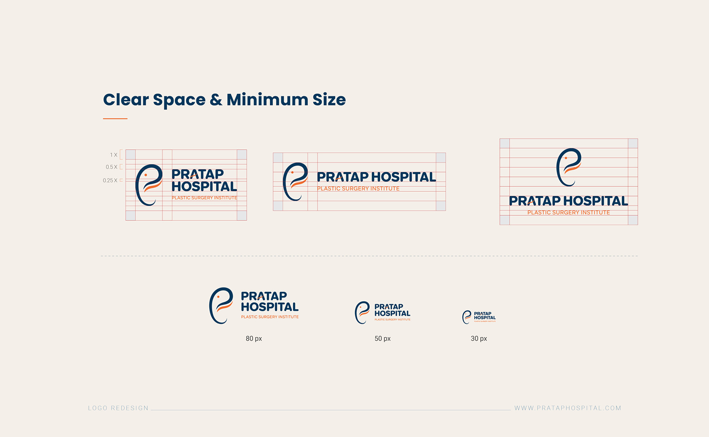
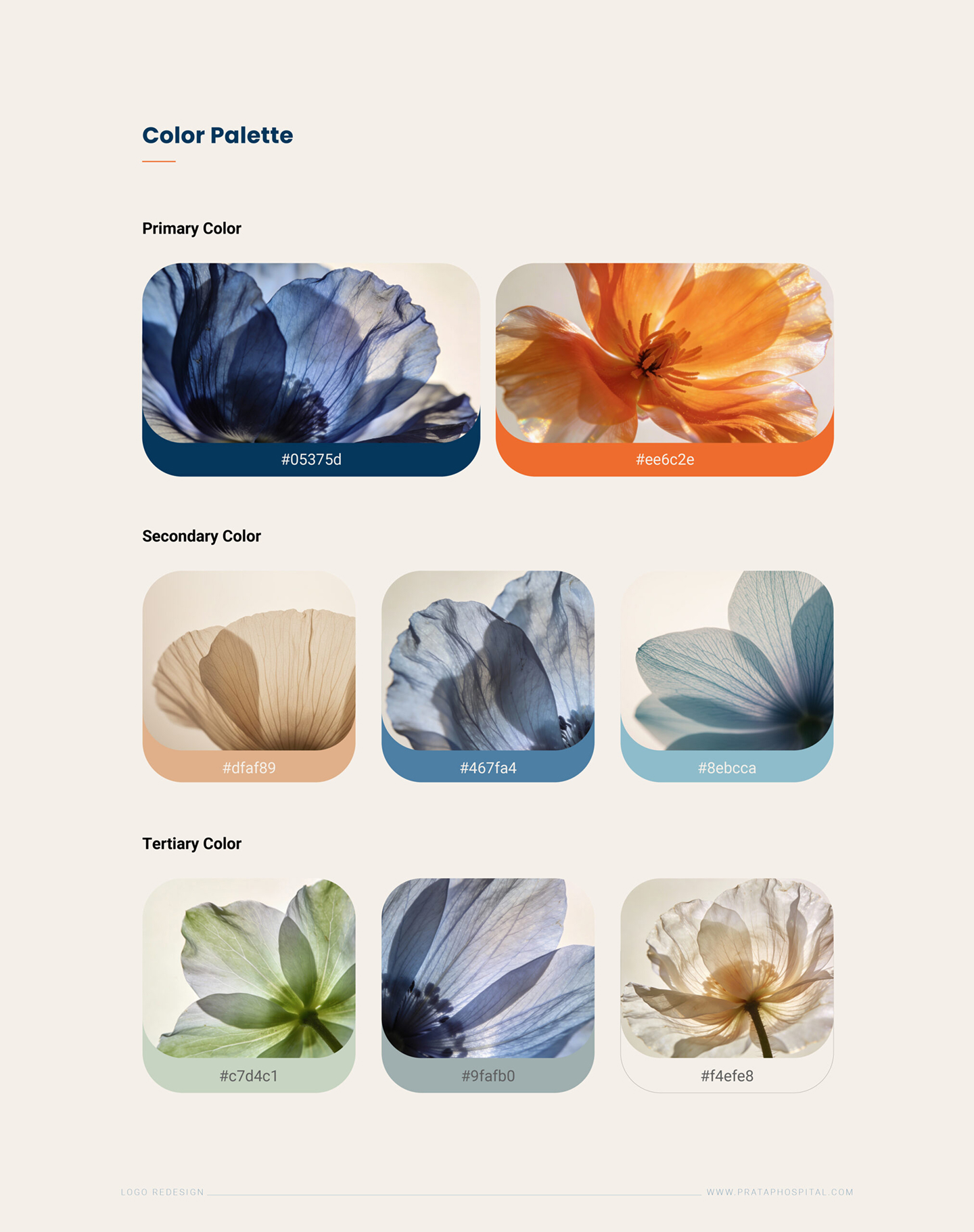
Clinical Trust Logo & Color System
Directional Signage & Navigation Panels
Ambulance Wraps & Staff RFID Badges
Brand Standards Manual & Medical Forms
Design Evolution
1
Week 1
•
Research & Tone
Establishing Clinical Trust
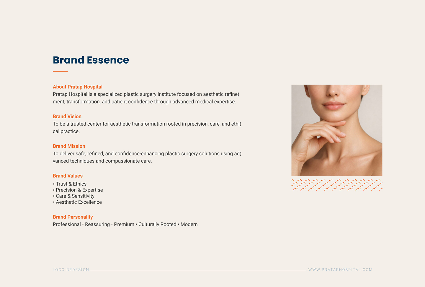
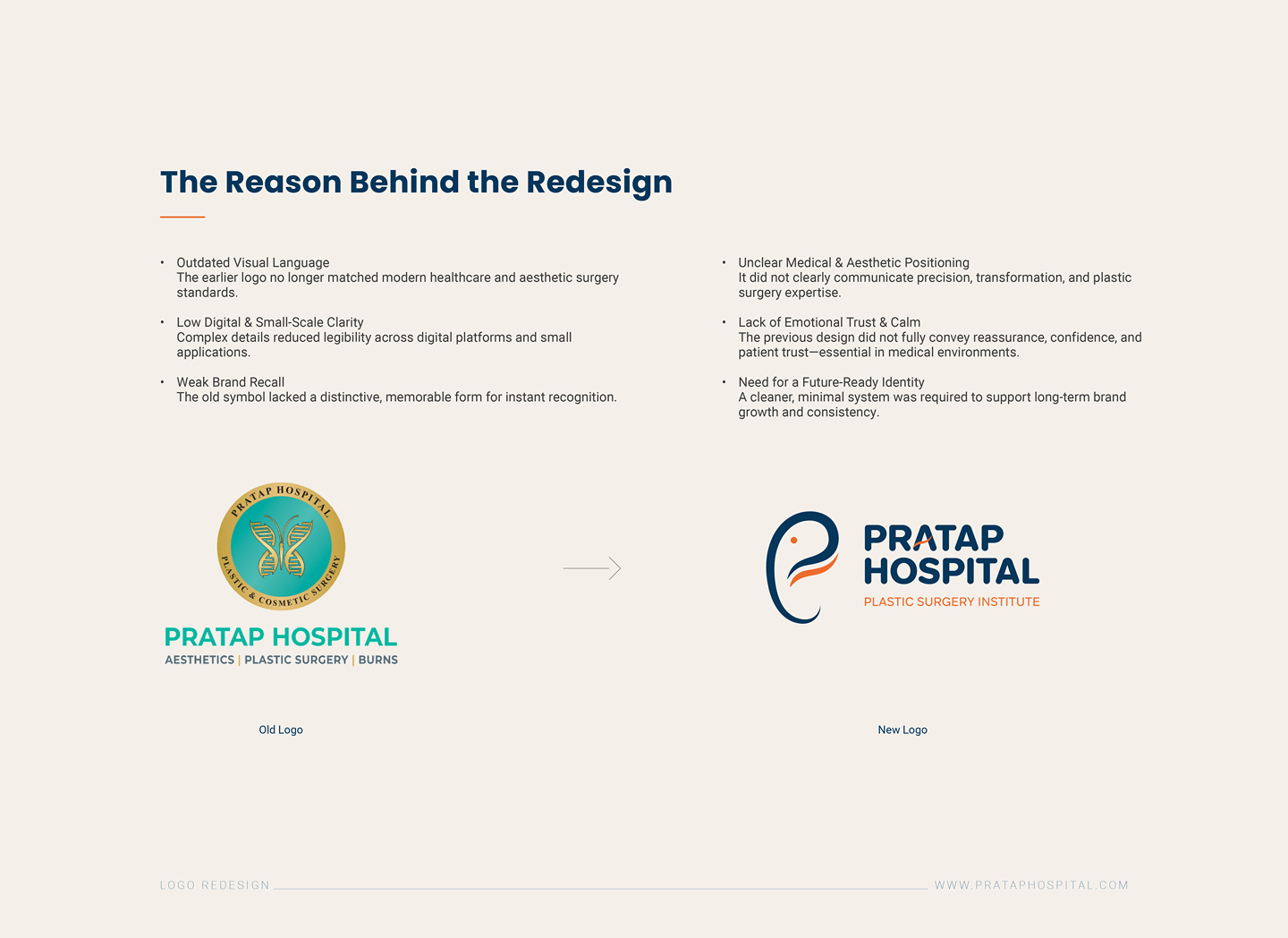
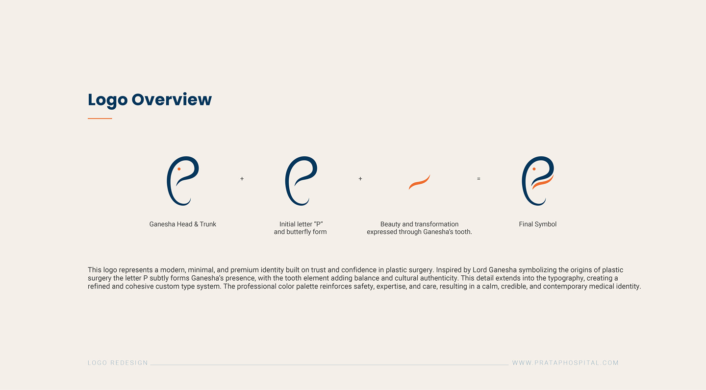
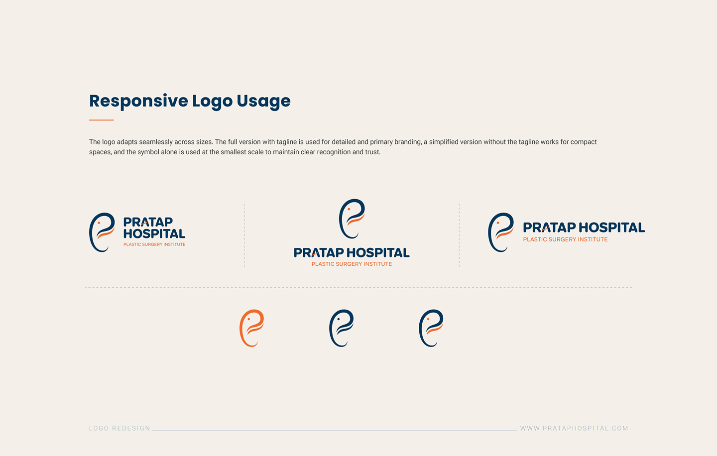
We researched healthcare wayfinding and brand visibility standards. Our goal was to create a warm, approachable logo mark that projects high safety, accessibility, and modern clinical expertise.
Key Research Insight
"Medical facility visitors under stress make navigation errors 52% less often when directional signs use high-contrast primary colors combined with clean, un-nested text layouts."
2
Week 2
•
Visual Language
High-Visibility Color Coding
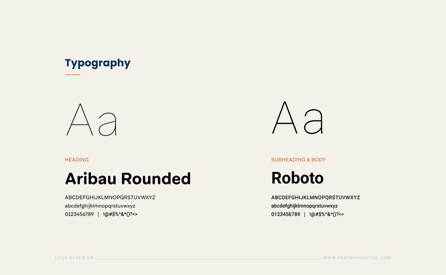
We customized clean sans-serif layouts for maximum readability. The color palette pairs secure trust blue with high-visibility orange accents for warnings and important wayfinding paths.
3
Week 3
•
Environmental Identity
Applying Identity to Physical Environments
We standardized directions signs, emergency vehicle wraps, stationery pads, and corporate uniforms to ensure instant brand recall and medical safety compliance.
01 • Wayfinding
Directional Signs
High-contrast directional navigation panels with bilingual patient legibility standards.
02 • Emergency Fleet
Ambulance Wraps
Reflective vinyl safety patterns and 360-degree rapid emergency highway visibility.
03 • Staff Collateral
Uniforms & Badges
Role-differentiated medical scrub tags, smart RFID access cards and lab coats.
04 • Clinical Stationery
Forms & Reports
Standardized prescription pads, pathology files, and confidential discharge folders.
Showcase Collage
Visual Identity Assets
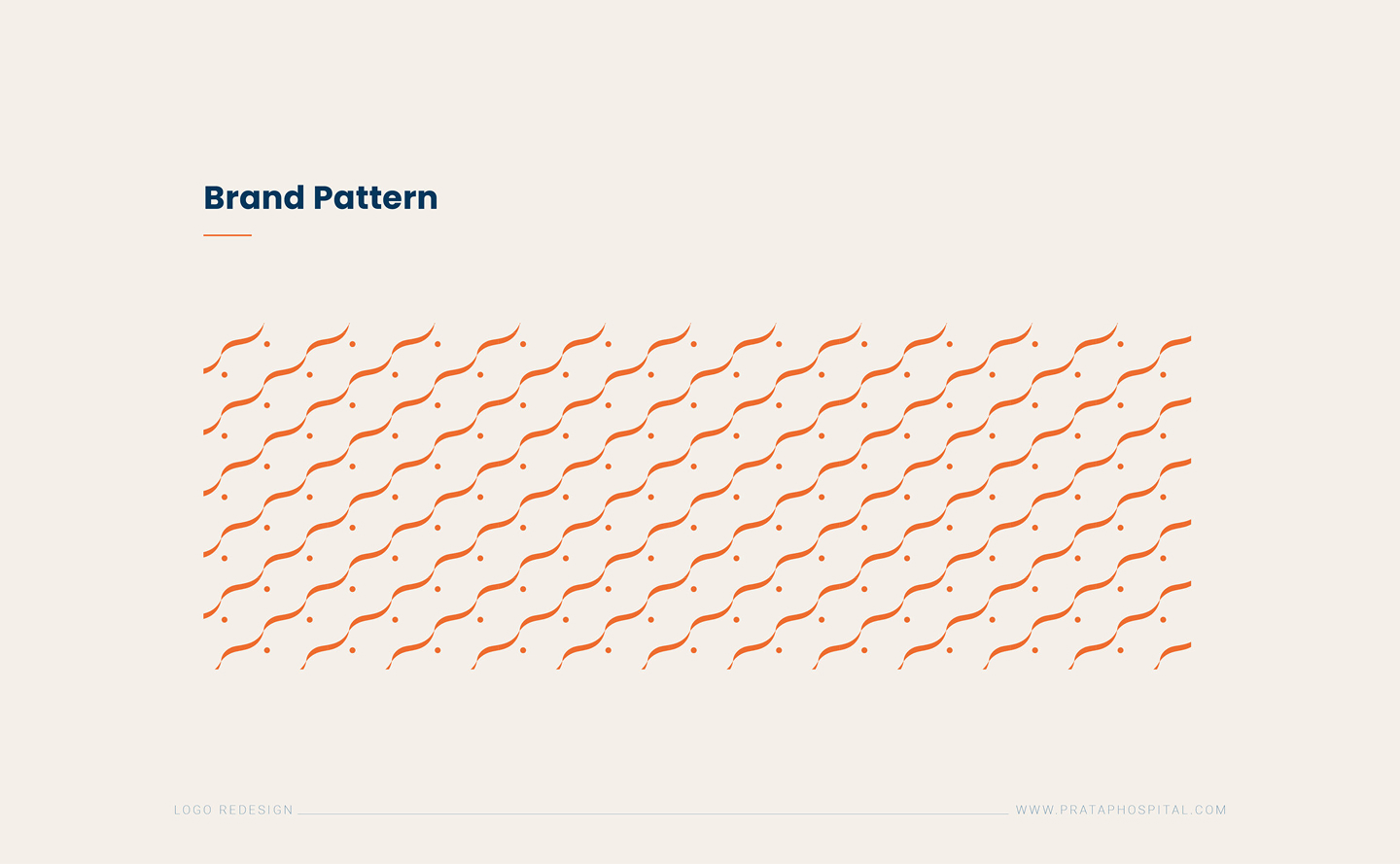
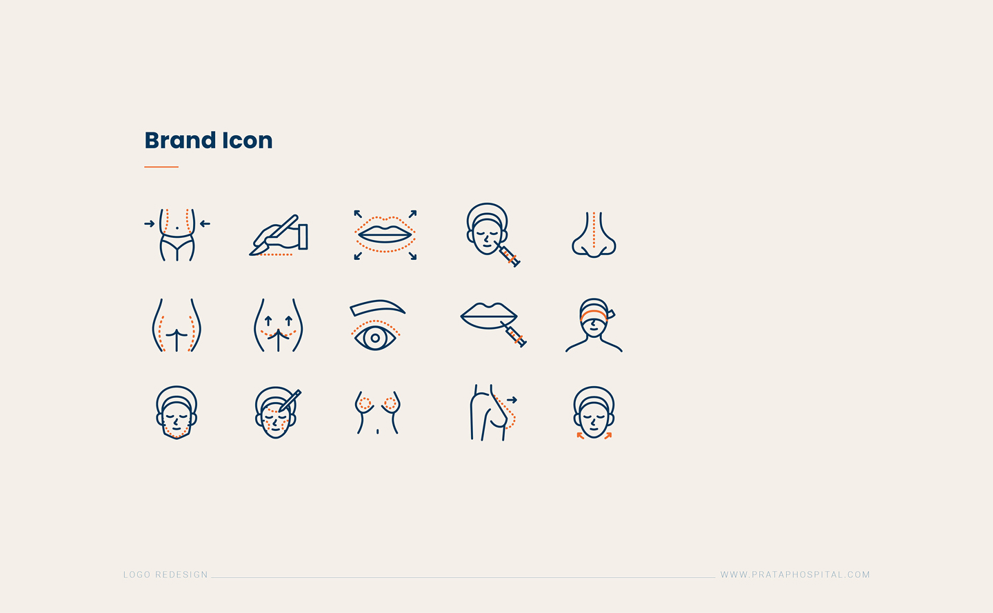
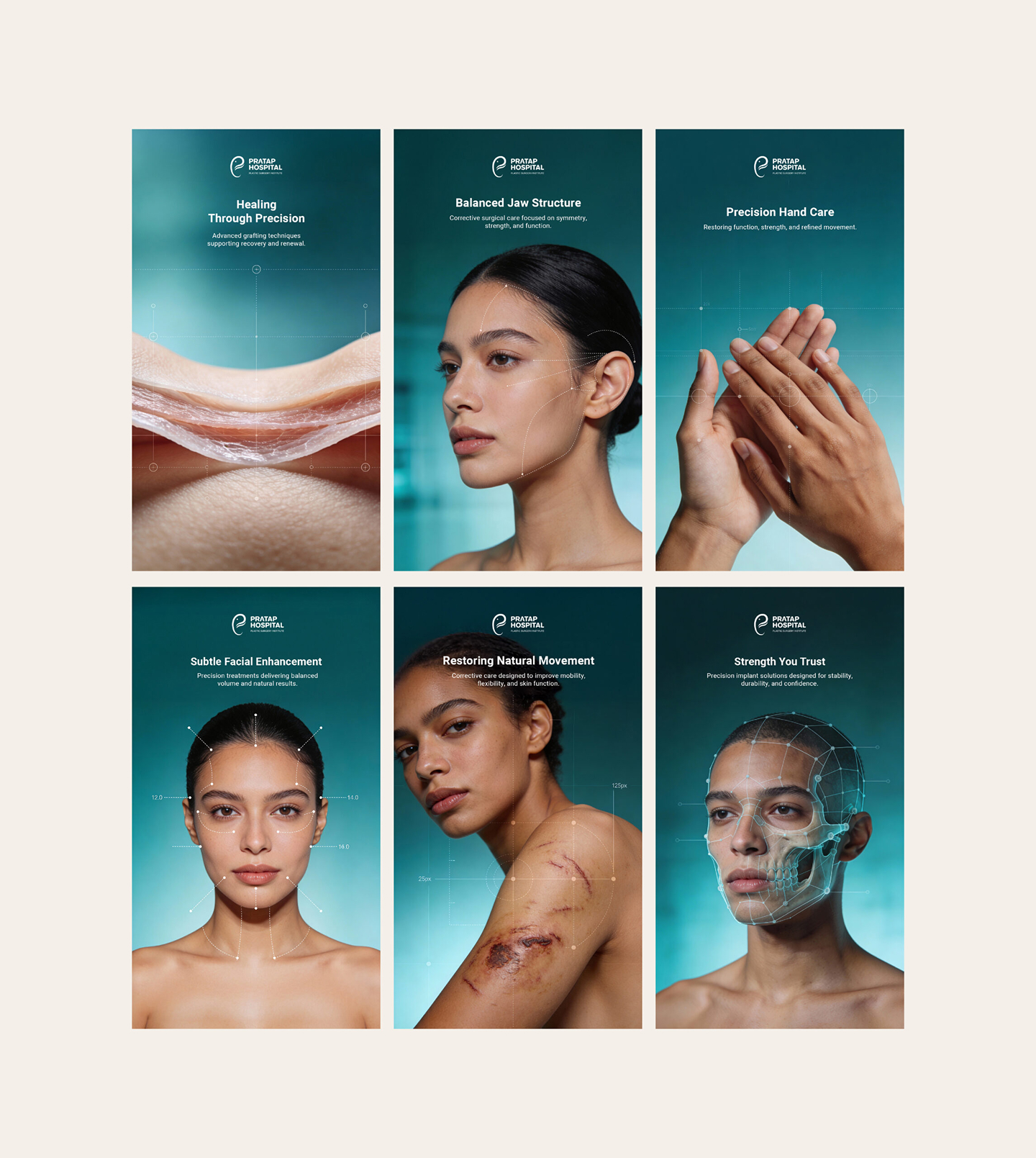
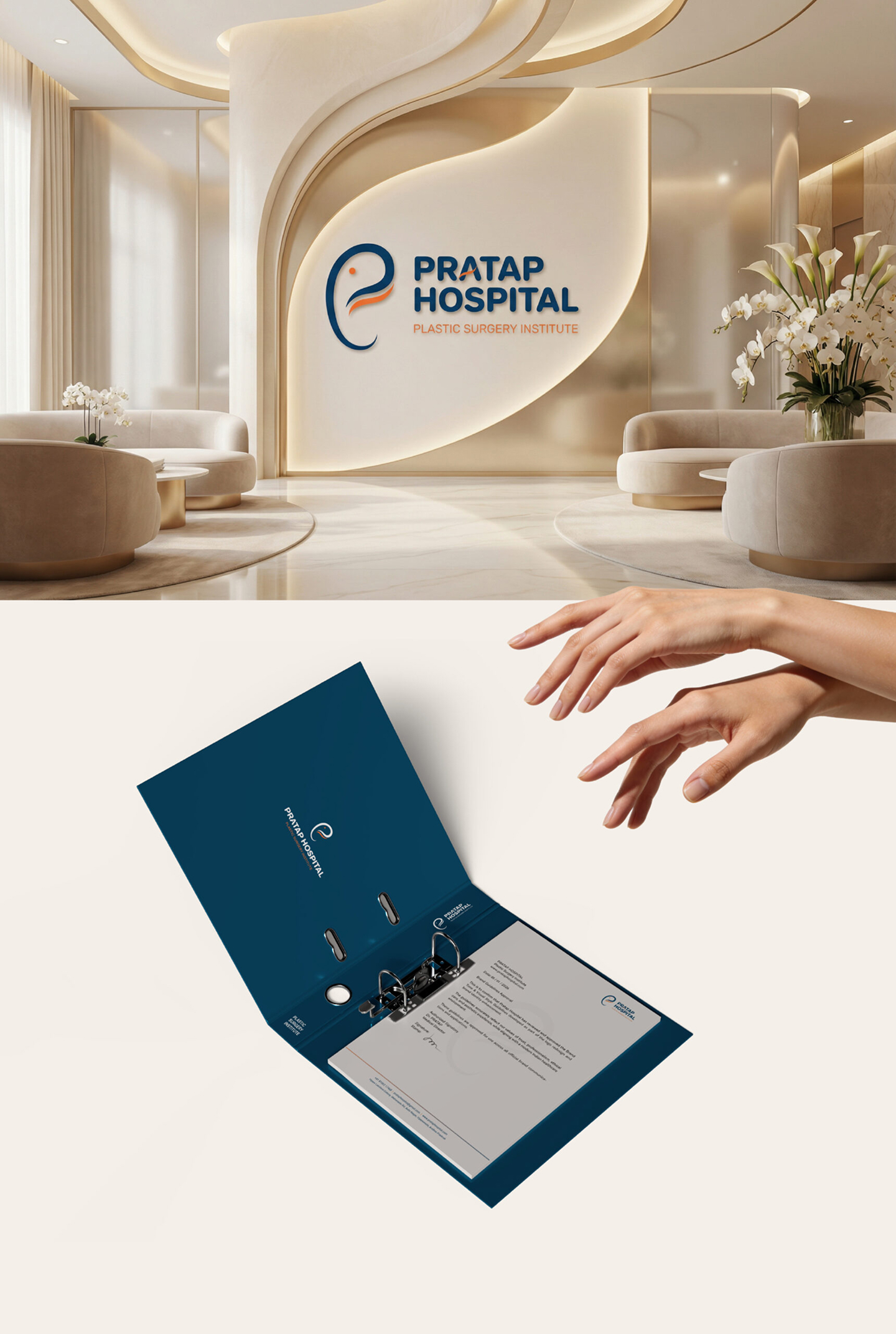
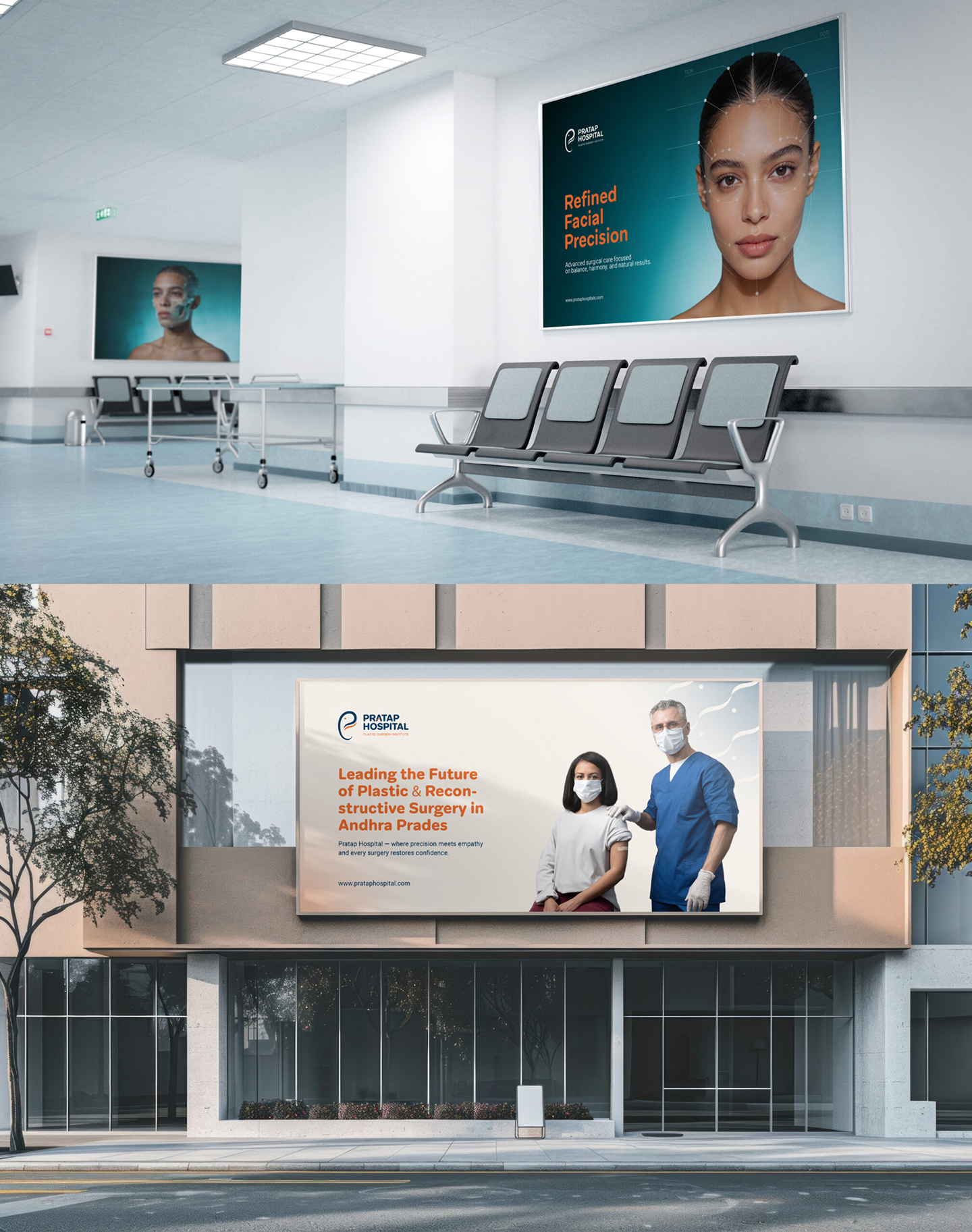
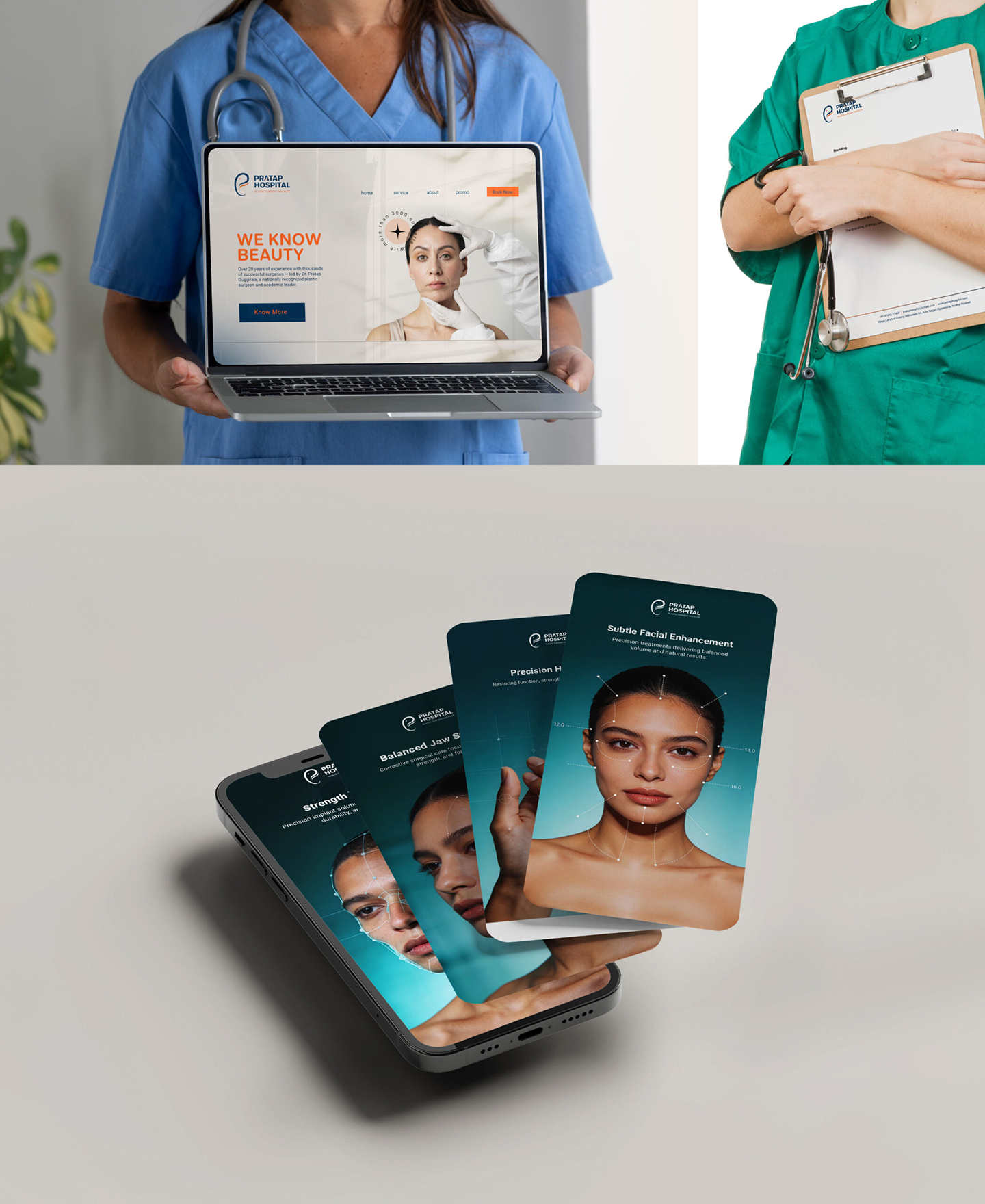
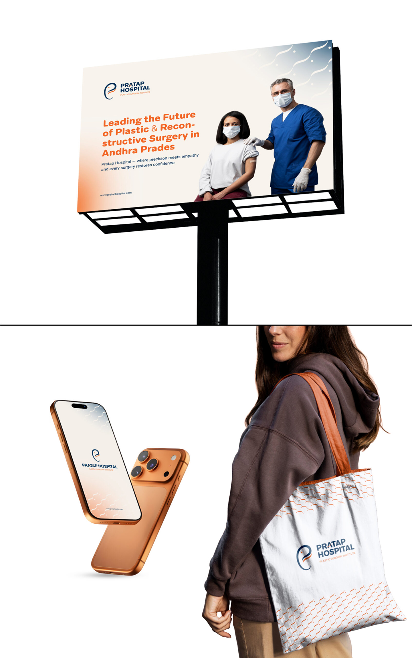
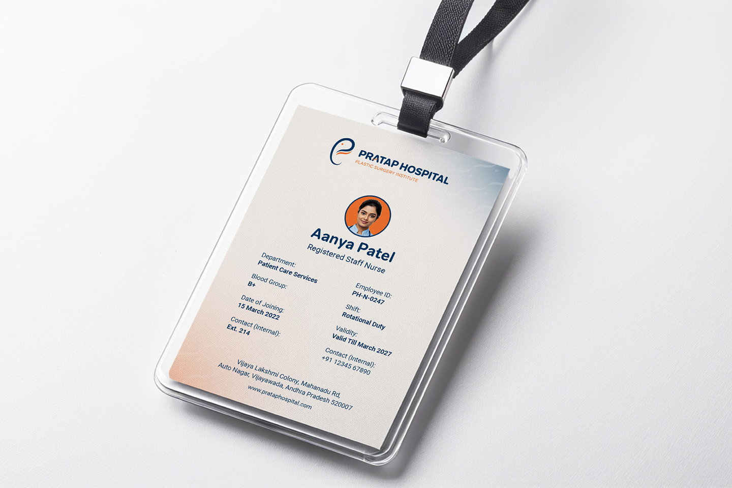
A comprehensive gallery showing all 17 brand visual collaterals, mockups, and layout presentation assets.


Dr. Alok Verma
Director of Operations, Hospital Group"The new wayfinding signage and branding system have drastically reduced patient navigation friction. The clean design reflects our commitment to modern medical care and accessibility."
Portfolio Showcase
Explore Other Projects
View All Projects
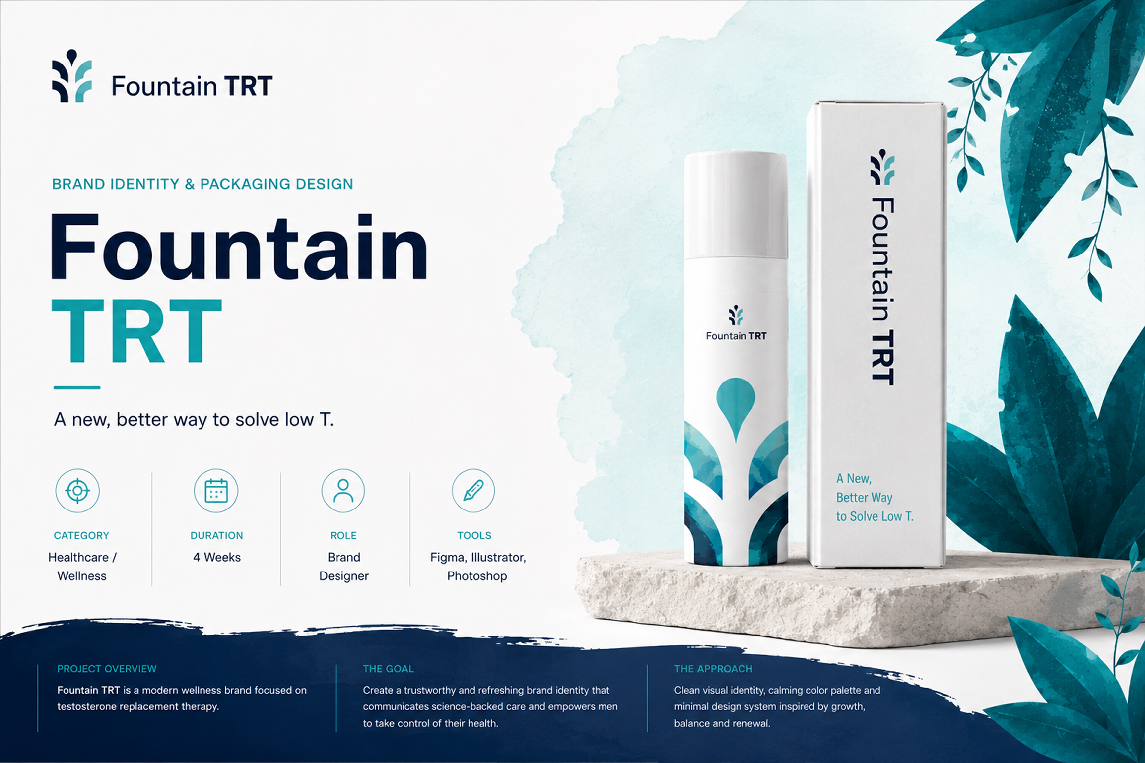
Telehealth, Web & Product Design
Website & Product Design (Fountain TRT)
Figma
UI/UX
View Case Study